Customizing Recharts graphs for React and testing them with Cypress
After I added the ability to collect and store code coverage stats in the Projektor test reporting tool, I wanted to also add a graph that showed the trend of code coverage over time. Then users could track their repo's code coverage to see if was increasing, decreasing, or staying the same.
The Projektor UI is built with React, so I explored graphing library options for React. I found different options available, and found that Recharts fit in the sweet spot of being customizable - for example, for making the graph clickable to go to an individual test run - but also high-level enough to encapsulate most of the visualization code.
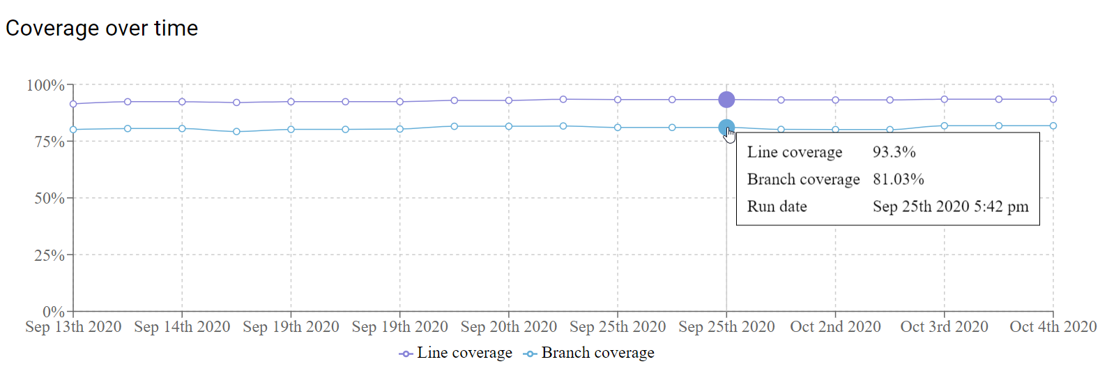
The Recharts website has a ton of examples, and I settled on the LineChart for this code coverage visualization. After adding some customizations, this is the resulting graph in Projektor:
Customization
As I mentioned, one of the strengths of Recharts is how flexible and customizable its graphs are. In the code coverage graph, I customized:
- display of the graph dots when hovered over and added a link to each point
- content of the hover tooltip
- format of the x-axis and y-axis labels
I also wanted to be able to verify the behavior of the graph, and the ability to customize the components also made it straightforward to add additional attributes that made it easier to interact with the elements during Cypress tests (more on this below).
Graph dots
For the active dot (the dot the user is hovering over with their mouse), I added:
- a link to an individual test report
- styling to make it look like a link
- a role attribute to make it easier to locate and click during tests
One small gap in these customizations is that, from what I could tell digging into the Recharts code,
there aren't Typescript types defined for the props passed into these custom elements.
So we're stuck with the untyped props component parameter of yesteryear.
 1import * as React from "react";
 2import { Dot } from "recharts";
 3import { navigate } from "@reach/router";
 4import { makeStyles } from "@material-ui/styles";
 5
 6const useStyles = makeStyles(() => ({
 7  dot: {
 8    "&:hover": {
 9      cursor: "pointer",
10    },
11  },
12}));
13
14const RepositoryGraphActiveDot = (props) => {
15  const classes = useStyles({});
16  const { cy, cx, fill, dataKey, payload } = props;
17  const { publicId } = payload;
18
19  const dotOnClick = () => {
20    navigate(`/tests/${publicId}`);
21  };
22  return (
23    <Dot
24      r={8}
25      cy={cy}
26      cx={cx}
27      fill={fill}
28      onClick={dotOnClick}
29      className={classes.dot}
30      role={`active-dot-${dataKey}-${publicId}`}
31    />
32  );
33};
34
35export default RepositoryGraphActiveDot;
For the non-active dot, I customized it just a bit to add a couple attributes to make it easier to verify in tests:
 1import * as React from "react";
 2import { Dot } from "recharts";
 3
 4const RepositoryGraphDot = (props) => {
 5  const { dataKey, payload } = props;
 6  const { publicId } = payload;
 7  const value = payload[dataKey];
 8
 9  return (
10    <Dot
11      {...props}
12      role={`dot-${dataKey}-${publicId}`}
13      name={`dot-${dataKey}-${value}`}
14    />
15  );
16};
17
18export default RepositoryGraphDot;
Hover tooltip
I wanted to customize the tooltip box that shows up when the user hovers over one of the line dots with their mouse. Specifically, customize it to show the line values with a percent sign after them and add a third item - the test run date. For example:
1<span data-testid="tooltip-line-coverage-percentage">
2    {lineValue}%
3</span>
And similar to other customized pieces, I added data-testid attributes to make the values easier to verify in tests.
The full code for the customized tooltip box:
 1import * as React from "react";
 2import { makeStyles } from "@material-ui/styles";
 3import moment from "moment-timezone";
 4
 5const useStyles = makeStyles(() => ({
 6  box: {
 7    outline: "1px solid black",
 8    backgroundColor: "white",
 9    padding: "5px 10px",
10  },
11  label: {
12    width: "120px",
13    display: "inline-block",
14  },
15  line: {
16    paddingBottom: "4px",
17    paddingTop: "4px",
18  },
19}));
20
21const RepositoryCoverageTimelineGraphTooltip = (props) => {
22  const classes = useStyles({});
23
24  if (props.payload && props.payload.length >= 1) {
25    const {
26      createdTimestamp,
27      lineValue,
28      branchValue,
29    } = props.payload[0].payload;
30
31    return (
32      <div
33        className={classes.box}
34        data-testid="coverage-timeline-graph-tooltip"
35      >
36        <div className={classes.line}>
37          <span className={classes.label}>Line coverage</span>
38          <span data-testid="tooltip-line-coverage-percentage">
39            {lineValue}%
40          </span>
41        </div>
42        <div className={classes.line}>
43          <span className={classes.label}>Branch coverage</span>
44          <span data-testid="tooltip-branch-coverage-percentage">
45            {branchValue}%
46          </span>
47        </div>
48        <div className={classes.line}>
49          <span className={classes.label}>Run date</span>
50          <span data-testid="tooltip-run-date">
51            {moment(createdTimestamp).format("MMM Do YYYY h:mm a")}
52          </span>
53        </div>
54      </div>
55    );
56  } else {
57    return <span data-testid="empty-tooltip" />;
58  }
59};
60
61export default RepositoryCoverageTimelineGraphTooltip;
Axis labels
Customizing the axis labels turned out to be straightforward, I just needed to create a transform function that would take the value and output the formatted string.
The x-axis is the test run date, and I wanted to be able to display those values with a specific date format:
1const xAxisTickFormatter = (value) => moment(value).format("MMM Do YYYY");
And the y-axis was the code coverage percentage, so I just wanted to append a percent sign to the end of the label:
1const yAxisTickFormatter = (value) => `${value}%`;
Using custom components in chart
Finally, bringing it all together to display the line chart and plugging in the custom components
such as <RepositoryCoverageTimelineGraphTooltip /> and <RepositoryGraphActiveDot />
 1<ResponsiveContainer width={graphWidth || "100%"} height={300}>
 2    <LineChart
 3      data={data}
 4      margin={{
 5        top: 30,
 6        right: 50,
 7        left: 20,
 8        bottom: 5,
 9      }}
10    >
11      <CartesianGrid strokeDasharray="3 3" />
12      <XAxis dataKey="date" tickFormatter={xAxisTickFormatter} />
13      <YAxis tickFormatter={yAxisTickFormatter} />
14      <Legend formatter={legendFormatter} />
15      <Tooltip content={<RepositoryCoverageTimelineGraphTooltip />} />
16      <Line
17        type="monotone"
18        dataKey="lineValue"
19        stroke="#8884d8"
20        activeDot={<RepositoryGraphActiveDot />}
21        dot={<RepositoryGraphDot />}
22      />
23      <Line
24        type="monotone"
25        dataKey="branchValue"
26        stroke="#64aed8"
27        activeDot={<RepositoryGraphActiveDot />}
28        dot={<RepositoryGraphDot />}
29      />
30    </LineChart>
31</ResponsiveContainer>
Testing
With Cypress tests, I wanted to verify several customizations of the chart:
- the chart displayed the customized graph dots correctly
- clicking on a graph dot sent the user to the test report page for the specific test run they clicked on
- the tooltip displayed with the correct values when the user hovered over a dot
The unit tests for the React UI use React Testing Library,
so I used the Cypress Testing Library
extension for Cypress to be able to use the same findByTestId functions in the Cypress tests as well.
For example, the test case to verify the display and links on the graph dots:
 1describe("repository coverage graph links", () => {
 2  it("should display repository coverage graph and link to individual test reports", () => {
 3    const repoName = "cov-org/cov-repo";
 4
 5    cy.intercept("GET", `repo/${repoName}/coverage/timeline`, {
 6      fixture: "repository/coverage_timeline.json",
 7    });
 8
 9    const publicIds = [
10      "2XMM8MYQTKM0",
11      "3RZRSBCSALZ2",
12      "WJIHLB2MTRAW",
13      "BYYUCDMQ5WJ6",
14      "KRXBI9GH213D",
15      "XPF0IHDJBLOO",
16    ];
17
18    cy.visit(`http://localhost:1234/repository/${repoName}`);
19
20    cy.findByTestId("repository-coverage-timeline-graph").should("exist");
21
22    publicIds.forEach((publicId) => {
23      cy.findByRole(`dot-lineValue-${publicId}`).should("exist");
24
25      cy.findByRole(`dot-branchValue-${publicId}`).should("exist");
26    });
27
28    const publicId = publicIds[0];
29    cy.findByRole(`dot-lineValue-${publicId}`).click();
30
31    cy.url().should("contain", `/tests/${publicId}`);
32  });
33});
I used Cypress' ability to trigger events to get the tooltip to appear during the test with: cy.findByRole(<role>).trigger("mouseover");
Then I can verify the values of the three fields on the tooltip. For example:
1cy.findByTestId("tooltip-line-coverage-percentage").should(
2  "contain",
3  "95.4%"
4);
The code for the full test case:
 1describe("repository coverage graph hover tooltip", () => {
 2  it("should display tooltip with coverage data on graph point hover", () => {
 3    const repoName = "cov-org/cov-repo";
 4
 5    cy.intercept("GET", `repo/${repoName}/coverage/timeline`, {
 6      fixture: "repository/coverage_timeline.json",
 7    });
 8
 9    const publicId = "WJIHLB2MTRAW";
10
11    cy.visit(`http://localhost:1234/repository/${repoName}`);
12
13    cy.findByTestId("repository-coverage-timeline-graph").should("exist");
14
15    cy.findByRole(`dot-lineValue-${publicId}`).trigger("mouseover");
16
17    cy.findByTestId("coverage-timeline-graph-tooltip").should("exist");
18    cy.findByTestId("tooltip-line-coverage-percentage").should(
19      "contain",
20      "95.4%"
21    );
22    cy.findByTestId("tooltip-branch-coverage-percentage").should(
23      "contain",
24      "68.95%"
25    );
26    cy.findByTestId("tooltip-run-date").should("contain", "Sep 13th 2020");
27  });
28});
Conclusion
Recharts is a feature-rich graphing library for React that is flexible so you can easily customize the graph's contents and appearance - without having to dive too deep into the graphing code. That flexibility also makes it easy to add custom attributes that you can use to verify the graph with Cypress browser tests.